فایل های ضمیمه : download
Code a Useful Expanding Vertical Navigation Menu
Today we have yet another awesome step-by-step CSS project for you! This time around we’re going to build a super useful expanding vertical navigation menu. It’s a great way to hide a lot of links in a fairly small space and the animations will add a nice touch to your site.
Even if you’re a complete beginner, you should be able to pull this off. I’ll guide you along every step of the way and explain how each chunk of code works so you can implement these same techniques in future projects and deepen your understanding of CSS. Let’s get started!
The Concept
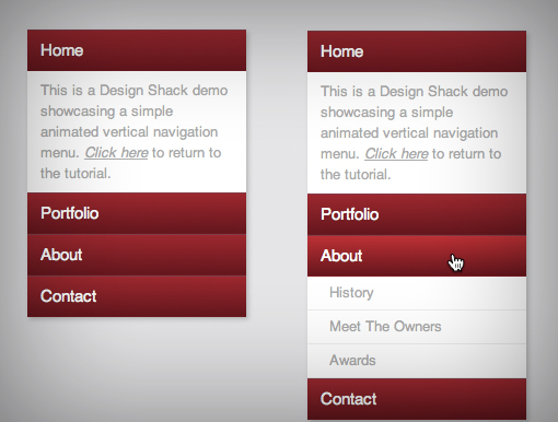
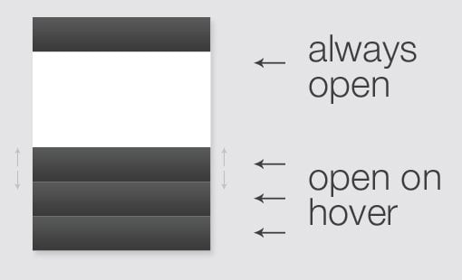
Before we start coding, it’s always helpful to lay out the rough concept of what you want to achieve so you can wrap your brain around what’s going to be involved. The item we’re building today is a vertical navigation menu that’s in a sort of modified accordion format (get a sneak peek of the finished producthere).
As you can see, the sections on the bottom are closed by default and slide open when you over over them. However, to add some nice variation we’ll also include a section that stays open all of the time. In the main section that is always open we’ll include a brief welcome message and in the sections that slide open will be sub-sections of navigation links.
Now that we have a good idea of where we’re going, let’s start outlining the structure in our HTML.
The HTML
The first thing we’re going to do is toss in some nice HTML5 to wrap the menu in. The new nav element provides a beautifully semantic container for our menu.
Now let’s think about how our menu is going to be structured. We’re not simply going to have a list of links, each bar represents a link with an additional area below it. We’ll wrap these up in a div. Then within each div we’ll need a main link (the colored bar) and a list of sub-links (the white area). Assuming that this item will be thrown into a site that already has some default styling, let’s arbitrarily settle on h4 for the main link and a simple unordered list for the rest.
|
01
02
03
04
05
06
07
08
09
10
|
<nav>
<div class="menu-item">
<h4><a href="#">Portfolio</a></h4>
<ul>
<li><a href="#">Web</a></li>
<li><a href="#">Print</a></li>
<li><a href="#">Other</a></li>
</ul>
</div>
</nav>
|
We can copy, paste and modify this section of code to make up the various pieces of our navigation menu. Here we have a Portfolio, About, and Contact section, each with three sub-links. Each section is given the same class (menu-item) so we can style them in one go.
|
01
02
03
04
05
06
07
08
09
10
11
12
13
14
15
16
17
18
19
20
21
22
23
24
25
26
27
28
|
<nav>
<div class="menu-item">
<h4><a href="#">Portfolio</a></h4>
<ul>
<li><a href="#">Web</a></li>
<li><a href="#">Print</a></li>
<li><a href="#">Other</a></li>
</ul>
</div>
<div class="menu-item">
<h4><a href="#">About</a></h4>
<ul>
<li><a href="#">History</a></li>
<li><a href="#">Meet The Owners</a></li>
<li><a href="#">Awards</a></li>
</ul>
</div>
<div class="menu-item">
<h4><a href="#">Contact</a></h4>
<ul>
<li><a href="#">Phone</a></li>
<li><a href="#">Email</a></li>
<li><a href="#">Location</a></li>
</ul>
</div>
</nav>
|
I wanted to focus on those areas first because they’re all the same, but remember that the top section is actually different, both in functionality and content. Instead of holding an unordered list, it will hold a paragraph. We’ll also add in a unique class to make it that much easier to target in our CSS.
|
01
02
03
04
05
06
07
08
09
10
11
12
13
14
15
16
17
18
19
20
21
22
23
24
25
26
27
28
29
30
31
32
33
|
<nav>
<div class="menu-item alpha">
<h4><a href="#">Home</a></h4>
<p>Lorem ipsum dolor sit...</p>
</div>
<div class="menu-item">
<h4><a href="#">Portfolio</a></h4>
<ul>
<li><a href="#">Web</a></li>
<li><a href="#">Print</a></li>
<li><a href="#">Other</a></li>
</ul>
</div>
<div class="menu-item">
<h4><a href="#">About</a></h4>
<ul>
<li><a href="#">History</a></li>
<li><a href="#">Meet The Owners</a></li>
<li><a href="#">Awards</a></li>
</ul>
</div>
<div class="menu-item">
<h4><a href="#">Contact</a></h4>
<ul>
<li><a href="#">Phone</a></li>
<li><a href="#">Email</a></li>
<li><a href="#">Location</a></li>
</ul>
</div>
</nav>
|
With that, we’re already finished with the HTML. Though it’s not styled at all, the live preview perfectly showcases the hierarchy of our navigation menu. Here you can clearly see our menu beginning to take form.
Base Styles
To start off our menu styling, we need to establish a few basics. First, we’ll clear the default margins and padding. We’ll be squishing the divs right up next to each other so any default browser spacing will ruin the layout.
Next, we’ll apply a simple color to the background so the white portions of our menu will stand out. Then we’ll toss in some basic font styles and add a slight shadow to the menu. Note that the margin set in the nav block centers the menu on the page, this is for display purposes only and should be removed when you want to nudge the menu into place.
Finally, we’ll add some dimensions and background color to the nav and menu-item selectors. Here’s the resulting code:
|
01
02
03
04
05
06
07
08
09
10
11
12
13
14
15
16
17
18
19
20
21
22
23
|
* {
margin: 0px;
padding: 0px;
}
body {
background: #e5e5e7;
}
nav {
font-family: Helvetica, Arial, "Lucida Grande", sans-serif;
line-height: 1.5;
margin: 50px auto;
width: 200px;
-webkit-box-shadow: 2px 2px 5px rgba(0,0,0,0.2);
-moz-box-shadow: 2px 2px 5px rgba(0,0,0,0.2);
box-shadow: 2px 2px 5px rgba(0,0,0,0.2);
}
.menu-item {
background: #fff;
width: 200px;
}
|
A this point, the preview is looking like we’ve done more harm than good, but fear not, it’ll start looking spiffy in no time.
Header Styles
Now it’s time to style our h4 tags and turn them into the horizontal bars that we saw in our mockup. To do this, we just need a little padding and a background color. While we’re here we can begin to style the typography as well. We’re inheriting the font-family we set up before so we don’t need to re-type that. Instead we just need to set a size and weight.
|
1
2
3
4
5
6
7
8
|
.menu-item h4 {
color: #fff;
font-size: 15px;
font-weight: 500;
padding: 7px 12px;
background: #a90329;
}
|
As you can see in the image below, our link styles are still overriding some of the type styles we set here so we’ll need to go in and fix those next.
Header Links
Obviously, the blue link is no good so we need to change that to white. We also want to ditch any text decoration (the underline). Now, we could stop here but the default behavior would be that only the text is clickable and not the whole bar, which is not ideal. To make the entire bar a link, we set the display property to block and the width to the full menu size (200px).
|
1
2
3
4
5
6
|
.menu-item h4 a {
color: white;
display: block;
text-decoration: none;
width: 200px;
}
|
Now our colored bar is looking much better. Here’s the preview:
Making It Pretty
If you want to stick with something simple, you can skip this step, but I’m going to trudge on and add a few more visual tweaks. Go back and modify that header style block to include a gradient and some very subtle borders. You likely won’t even be able to spot the borders until the menu is closed, but combined with the gradients they’ll really help differentiate each section so they don’t all look like one big block.
|
01
02
03
04
05
06
07
08
09
10
11
12
13
14
15
16
17
18
19
|
.menu-item h4 {
border-bottom: 1px solid rgba(0,0,0,0.3);
border-top: 1px solid rgba(255,255,255,0.2);
color: #fff;
font-size: 15px;
font-weight: 500;
padding: 7px 12px;
background: #a90329;
background: -moz-linear-gradient(top, #a90329 0%, #8f0222 44%, #6d0019 100%);
background: -webkit-gradient(linear, left top, left bottom, color-stop(0%,#a90329), color-stop(44%,#8f0222), color-stop(100%,#6d0019));
background: -webkit-linear-gradient(top, #a90329 0%,#8f0222 44%,#6d0019 100%);
background: -o-linear-gradient(top, #a90329 0%,#8f0222 44%,#6d0019 100%);
background: -ms-linear-gradient(top, #a90329 0%,#8f0222 44%,#6d0019 100%);
background: linear-gradient(top, #a90329 0%,#8f0222 44%,#6d0019 100%);
filter: progid:DXImageTransform.Microsoft.gradient( startColorstr='#a90329', endColorstr='#6d0019',GradientType=0 );
}
|
Hover Styles
Next we’re going to add a subtle hover style to the bar links. All we’re going to do is tweak the colors on the gradient a little so they get brighter when you hover.
|
01
02
03
04
05
06
07
08
09
10
|
.menu-item h4:hover {
background: #cc002c;
background: -moz-linear-gradient(top, #cc002c 0%, #6d0019 100%);
background: -webkit-gradient(linear, left top, left bottom, color-stop(0%,#cc002c), color-stop(100%,#6d0019));
background: -webkit-linear-gradient(top, #cc002c 0%,#6d0019 100%);
background: -o-linear-gradient(top, #cc002c 0%,#6d0019 100%);
background: -ms-linear-gradient(top, #cc002c 0%,#6d0019 100%);
background: linear-gradient(top, #cc002c 0%,#6d0019 100%);
filter: progid:DXImageTransform.Microsoft.gradient( startColorstr='#cc002c', endColorstr='#6d0019',GradientType=0 );
}
|
Paragraph Styles
Remember that the first item in our menu holds a paragraph and not an unordered list, so next we’ll attack this to get it looking nice. The lists will take a sizable chunk of code but the paragraph hardly requires anything. Just define the size and color, then toss in some padding.
|
1
2
3
4
5
6
|
.alpha p {
font-size: 13px;
padding: 8px 12px;
color: #aaa;
}
|
The top section is now looking great! Both the header bar and the paragraph are exactly where we need them to be.
Unordered List Styles
There’s a ton of stuff that we need to do to get these lists straightened out. Let’s switch things up a bit and look at the code first, then I’ll walk you through it.
|
01
02
03
04
05
06
07
08
09
10
11
12
13
14
15
16
17
18
19
20
21
22
23
24
25
26
|
.menu-item ul {
background:#fff;
font-size:13px;
line-height:30px;
list-style-type:none;
overflow:hidden;
padding:0px;
}
.menu-item ul a {
margin-left:20px;
text-decoration:none;
color:#aaa;
display:block;
width:200px;
}
.menu-item li {
border-bottom:1px solid #eee;
}
.menu-item li:hover {
background:#eee;
}
|
As you can see, the first block targets the unordered list as a whole unit. Here I set some basic sizing and font styles and removed the bullet point by setting list-style-type to none.
Next I targeted the links specifically. I moved them over, removed the underlines, set the color and performed the same display:block trick that we saw before to make the clickable area larger.
To finish things off, I applied a few custom styles to the list items themselves. The bottom border creates a separation between each item and the hover style changes the background. Here’s the result of our labor, our menu is almost finished!
Collapse And Animate
Up to this point, we’ve kept our menu opened up so that we could see it while we style the elements within. Now that we know that all of our visual styles are exactly like we want them, it’s time to collapse each section and then set them up to pop open on hover.
By default, browsers will set the height of those unordered lists to auto, meaning they’ll be just tall enough to hold all of the content within. To collapse the menu sections so that only the bars show, we can target those unordered lists and set the height to 0. Notice that we’re leaving the paragraph alone, this will ensure that our top section is always open.
|
01
02
03
04
05
06
07
08
09
10
|
.menu-item ul {
background: #fff;
font-size: 13px;
line-height: 30px;
height: 0px;
list-style-type: none;
overflow: hidden;
padding: 0px;
}
|
Now our menu is much shorter and doesn’t eat up so much space. You can also finally see the benefit of those gradients and borders that we implemented before.
Animating the Transition
Next we’ll want to open these menus back up on hover, but before we do that, let’s set up an animation so the transition is nice and gradual. Make sure you insert the various browser extensions and target the height property.
|
01
02
03
04
05
06
07
08
09
10
11
12
13
14
15
16
17
|
.menu-item ul {
background: #fff;
font-size: 13px;
line-height: 30px;
height: 0px;
list-style-type: none;
overflow: hidden;
padding: 0px;
-webkit-transition: height 1s ease;
-moz-transition: height 1s ease;
-o-transition: height 1s ease;
-ms-transition: height 1s ease;
transition: height 1s ease;
}
|
Expanding on Hover
All that’s left to do now is make it so that when you hover, the ul expands. This is tricky though so be careful. Your instinct may be to do something like “ul:hover” but that’s not what we want. Instead, we want to make it so that you can hover anywhere in that menu item, either in the bar or the unordered list. However, the item that we want expanded is still only the ul. Here’s what our selector looks like:
|
1
2
3
|
.menu-item:hover ul {
height: 93px;
}
|
Sometimes reading a selector backwards is helpful when trying to figure out what it does. This tells our browser to set a height of 93px to our unordered lists when a .menu-item is hovered over.
One important thing to note here is that we can’t just set the height to auto because for some reason this disables the animation. If you don’t want the animation, a height of auto is much more flexible and allows you to vary the number of sub-menu items. If you want to do this with the animation, you’ll have to target the height for each individually.
See It In Action
Our menu is now complete. Be sure to kick the tires in the demo to see how it all works. I’ll also throw in a link to the completed code so you can have a look at it all together.
Demo: Launch Demo
See the Code: Check out the HTML and CSS on Tinkerbin
Conclusion
I hope you enjoyed this walkthrough of building an animated vertical navigation menu. In implementation, it’s very similar to the animated download buttons that we built the other day so you should really be getting the hang of hiding and showing content using pure CSS.
Look out for an even better version of this menu to pop up on our brand new sister site, Design Curate. You’ll find a ton of great freebies there that you can download and implement in your projects today.


 دریافت لینک مستقیم